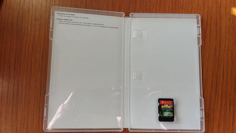
The release of Crash Bandicoot: N. Sane Trilogy on the Nintendo Switch leaves me feeling bare and hollow. Not that the collection of games isn’t worth it because, as Crash fans will tell you seeing I am not one, it is, but rather because of the lazy packaging. Inside the Switch case, you’ll find no manual, no inner sleeve art, no effort whatsoever to make it look like video games are something to be celebrated.
I get it! Activision needs to pocket that ink money, and nobody buys physical games anymore to enjoy a nice manual or inner art anyway. A simple link to an online PDF is all you really need to call it a day anymore.
This is nothing new, but it seems like a new extreme. I’ve grown accustomed to how boring manuals have become over the years. I used to pour over these booklets in my youth, sometimes even more than actually playing the games themselves! I would sometimes gaze at the artwork for hours on the school bus or in a local park on weekdays, when I was not allowed to play games, and just be fascinated by what awaited me once I was allowed to turned on the console.
But that was then, and nowadays, imagination has been replaced by technology and is nothing more than fodder for sentimental softies! Stop reminiscing and just play the game, old man!
…
Sigh…
For an age of gaming that is more inviting to outsiders than ever, or so I’ve been told by marketing firms and press conferences, it sure has a cold, corporate exterior. So, instead of wallowing in my sorrows, I’d like to focus on something happy for a moment. A publisher that enjoys nothing but universal love for its contributions to the history of gaming thanks and for the passion that its workers put into making its games the most appealing on the market.
Working Designs didn’t need to go on a big E3 stage and barf out how much it loves the games it makes. You could see that love in its packaging and presentation.
Working Designs was founded in 1986 by gaming enthusiast Victor Ireland and found its market by localizing niche games for consoles that nobody owned, most notably the TurboGrafx-16. Throughout the 80s and 90s, Ireland and crew survived on the philosophy that video game localizations could be more than just a literal translation of Japanese text. A solid localization could be a work of art in and of itself, a notion that Square and Konami would eventually pick up for Final Fantasy and Metal Gear Solid respectively.
After scoring a world praise with the Lunar games on SEGA CD from those who actually got to play them, Working Designs took their philosophy to the next generation on the SEGA Saturn and more prevalently, the PlayStation.
And its first PlayStation release? Oh, it’s a beauty.
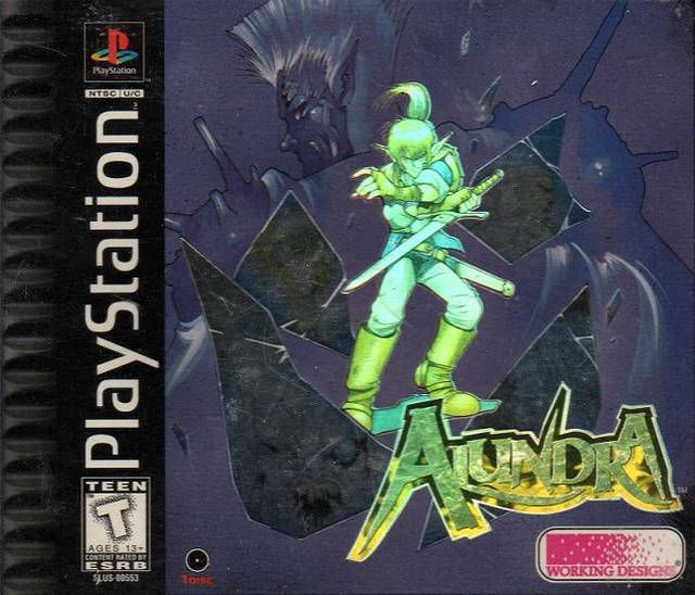
I’ve dedicated quite a large amount of keyboard pounding to Alundra over the years at TechnoBuffalo, dedicating my first Retro Review to it and calling it nothing short of the best Zelda-clone of all time. In fact, nowadays, I’d take it over even the best Zelda games out there.
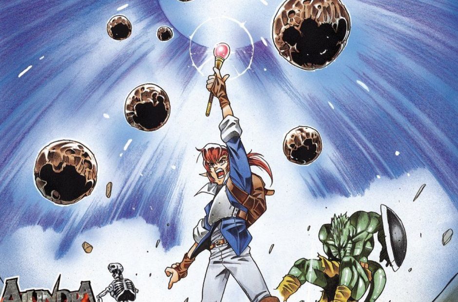
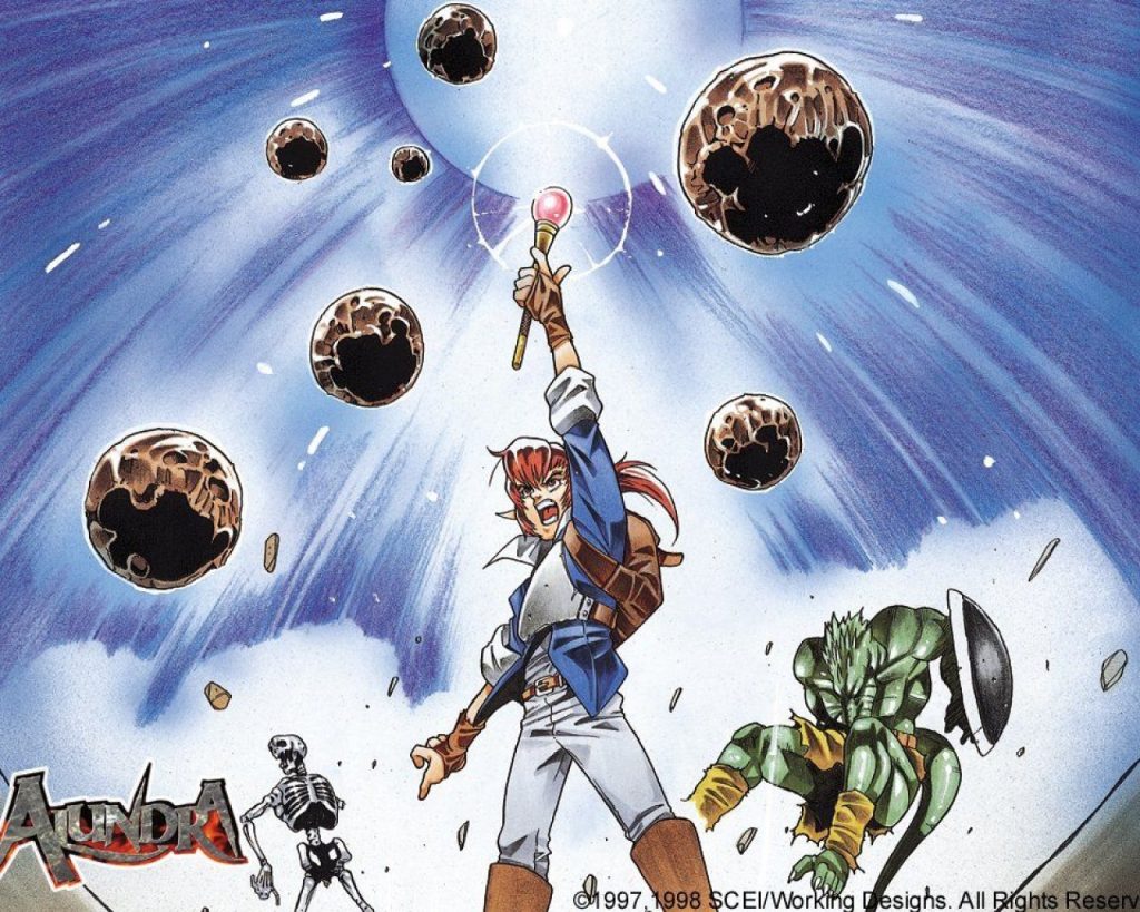
My two decades with this gaming marvel would never have been possible without Working Designs packaging it look like the greatest flippin’ game on Earth. You see, the internet existed in 1997, but it wasn’t as widely utilized for marketing games as it is today, and like everyone else, it was the cover that often lured me into renting a game for the weekend. I picked up Alundra at my local rental shop in 1998 because I thought the protagonist looked like a cool anime elf on the cover and because the title was all flashy and holographic, like a shiny Magic card.
After I got home from the store but long before I threw the game in my PlayStation, which I think was new at the time since Alundra was one of the first PlayStation games I played after buying Final Fantasy VII and Final Fantasy Tactics along with the console, I was greeted to the inner fold artwork and the game’s timeless instruction manual.
Now, this might make me hypocritical since I called out Activision for doing so at the top of this article, but the best I can do is provide a link to Alundra’s manual. It’s not the same as holding it in your hands, but unless you’re lucky enough to own this game physically, it’s the best we’ve got for today’s little experiment.
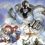
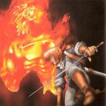
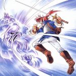
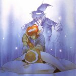
Please take a few minutes and just pour over these pages. Soak in this gorgeous concept art. Read about the weapons, magic, and characters. If you’ve never played the game, which will hopefully change after I write about it a couple dozen more times and remind you it’s just $5.99 on the PlayStation Store, just imagine yourself in this gaming world. What are these monsters? Who are these people? What is this town struggling against? Who is that elf lady? What the heck is that giant idol? Is Alundra some kind of ghost? Can he inhibit dead bodies?
Is that a giant monkey, I see?
Have you done so for a few minutes or so? Good! You’ve taken your first step into a larger world, that of being a 90s gamer. All of the answers to your questions are waiting for you to discover in the game. And you probably have a lot of questions since the packaging provides so much information while still giving nothing away. No, you can’t go watch a Let’s Play and call it a day. Let your imagination run free, and let this manual merely steer you through every second of Alundra’s perilous and tragic quest.
The only drawback at the moment is that you can’t feel the high quality texture of the paper or the contoured title cover. Feeling the pages flip is just as important to the experience as soaking in the art and information. Never underestimate the power of holding an actual physical book. Of all my gaming possessions, my copy of Alundra and its manual will still be there after all else has fallen, been sold off, or been replaced by the convenience of digital gaming.
Now, we’ve turned the game on and what greets us? Oh man…
I’ll never get over the first time I saw this. Alundra’s introduction is a creation of Working Designs, one stitched together from cutscenes in the Japanese version. Being released in a different market means that the publisher needed a new way to greet the play the first time they turned the game on, and the rocking music, an original tune not found in the Japanese version either, sums up that this is also an action game on top of an RPG.
Plus, I hate it when anime cutscenes rip me from my sprites. Let the pixels to the talking, please!
Introduction videos work. I’ve discussed this at length as well. It works for Soul Blade. It works for Wild ARMs. It works for any modern game that dare take a few minutes to remind you of the adventure you’re about to embark upon every time you turn on the game.
Working Designs understood this and nailed it with this video. Again, like in the manual, you get to see our hero Alundra fighting monsters. You see how his arsenal is put to use. You see characters in the game, action set pieces and exotic locations, that idol now crumbling to the ground, and also, you get to see gameplay for the first time! Alundra’s sprite looks just like the character art, bosses too.
And mine carts! Sweet!
Alundra is a masterpiece of localization, and guess what, I haven’t even talked about the game’s flawless writing and pacing! Everything you need to know before you turn the game on can be found in the case, the inner art folds, the manual, and the sweet introduction. That’s because it was made by gamers who knew what gamers wanted, and there in lies the spirit of Working Designs’ philosophy.
Working Designs would carry on in this fashion for many more games on the PlayStation. Alundra’s efforts served as a template for all of the company’s normal releases, but on occasion, the company would go a little overboard and deliver something truly amazing.
The Lunar games were always the passion of the folks at Working Designs. The first two games put the fledgling studio on the map back in the SEGA CD days, and after Working Designs’ success in the PlayStation days, they repaid the two RPG gems with pristine localization and packaging for the two PlayStation remakes. If you’ve never seen the four-disc collector’s editions of Lunar: Silver Star Story Complete or Lunar 2: Eternal Blue Complete, you would be forgiven for realizing they were not PlayStation games in the first place.
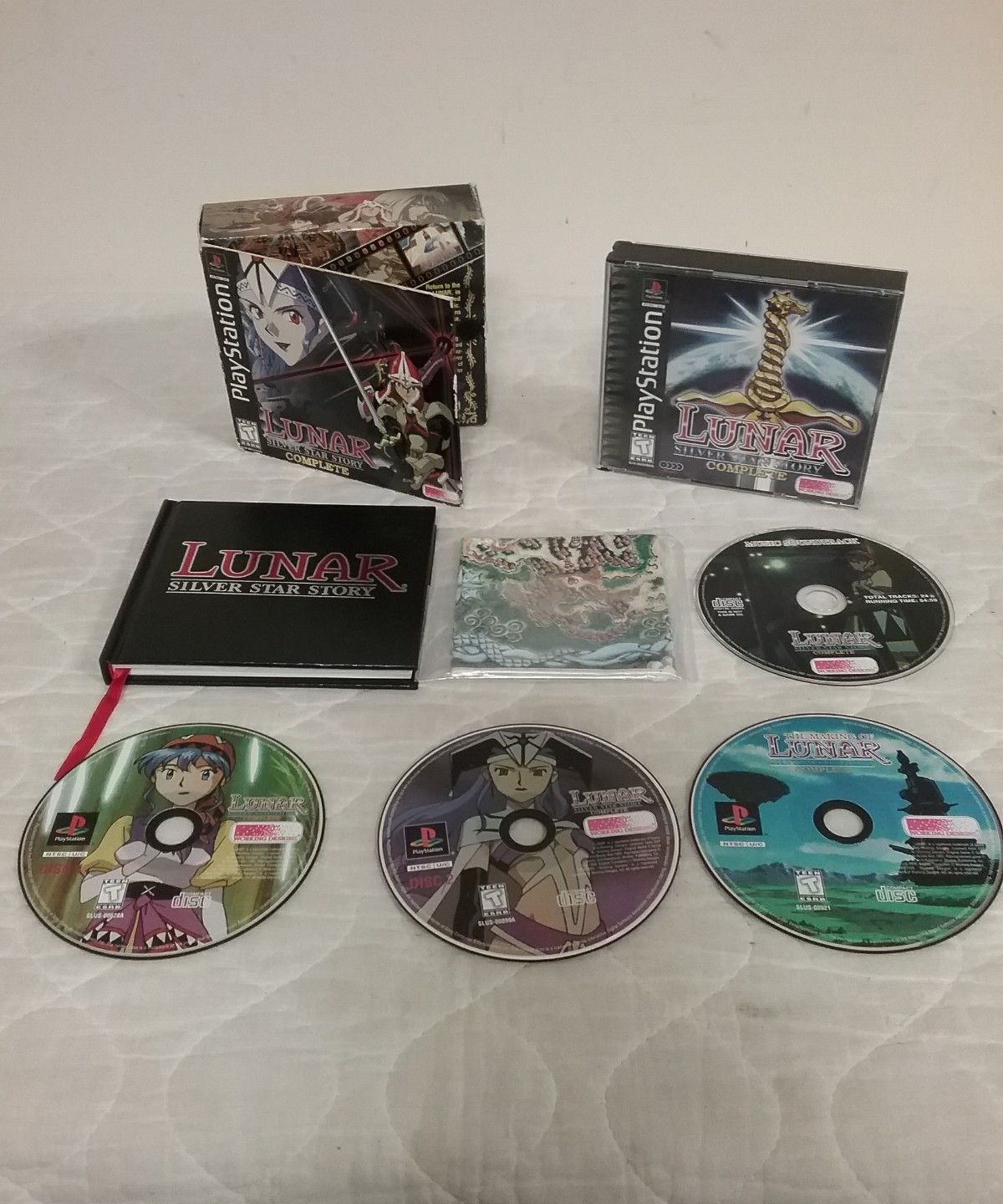
The box itself is a tome three or four times larger than a typical PlayStation jewel case. Tucked away inside, the innards are bathed in anime concept art, a map of Lunar’s world, and a genuine hardcover instruction manual filled with more content than even Alundra’s. The thing even has a bookmark, hinting that this isn’t something you can read in one sitting!
Working Designs also included the game’s 24-song soundtrack and a commentary CD that details how the game was made and localized.
Now, I know that you see one of these collector’s editions every single week when it comes to new AAA releases, but neither of these Lunar games has that reek of existing just to get you to cough up more money. This collector’s edition was the only way to buy the Lunar title, meaning that Working Designs knew that they had a limited audience and wanted to treat those dedicated fans with something truly special.
When you look at these Lunar games, you never once feel that Working Designs was just trying to shake a few extra bucks out of your pocket.
Plus, such an idea was so rare in 1999! The gaming world never had seen a game celebrated in such a way, and for the occasion to be for such a niche and (sorry to say) painfully average JRPG that only SEGA CD owners had ever heard of… well, you just had to check it out. If a publisher put this much effort into localizing and decorating a game, what choice is there other than to see what’s inside?
The self-fulfilling gratification that Working Designs got in showing their love for the series must also have been a total dream come true.
I still have my copy of Lunar: Silver Star Story Complete, but I never got around to tracking down the sequel. I’ll have to make that happen someday. It’s something I’ll want in the future when I think about the happy days of JRPGs.
Working Designs would carry on throughout the next half decade in a similar fashion, but to a much lesser extent. The cost of localizing bloated PlayStation 2 JRPGs obviously hindered the small company’s ability to keep up with the times.
Instead, it turned to even more niche releases with the Arc the Lad Collection, a bundle of four PlayStation games released deep in 2002, far removed from their original launches in Japan. I remember the excitement for this release in magazines being through the roof despite contemporaries Devil May Cry, Metal Gear Solid 2, Grand Theft Auto 3, and Final Fantasy X redefining a new generation of games at the time
Buying into a $70 bundle of old, unknown games while the world around was changing so rapidly, that shows the love gamers had for Working Designs well after its prime.
Working Design’s final imprint on the gaming world came in 2004 when it delivered another collection of old RPGs called Growlancer Generations. Their traditional mentality still fortified this gorgeous release, introducing Western games to two older RPGs via a deluxe box and swathes of gorgeous anime artwork.
I remember buying this release, and while the localization was fantastic, the games sadly were not up able to live up to it. Maybe, sometime in the future, I’ll get around to giving them another try.
Times changed, and Working Designs’s extravagant localization jobs could not survive in the modern world. The company went defunct in 2005, Victor Ireland fired up another smaller company called Gaijinworks, and only through Atlus and a few smaller studios like Monkey Paw anymore can we really find that same passion for localization or brilliant packaging.
Not because it is totally lost, but because it’s become exploited and commonplace. You just need to tag on $39.99 to your normal purchase if you want to celebrate your passion for video games. Otherwise, you obviously lack the dedication of real gamers and can only have the Crash Bandicoot: N’ Sane Trilogy option.
So little questions, so little answers… I wonder how Alundra is going to overcome this white, blank screen.
